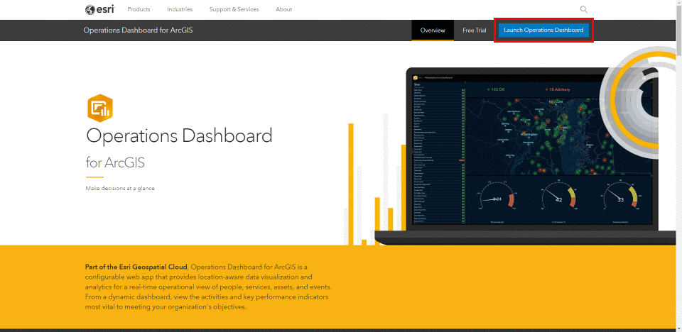
Operations Dashboard for ArcGIS is a configurable web app providing geospatial data visualization, analytics, and a real-time view of events as they occur. Monitor your workforce, assets (mobile or stationary), and events from a single interactive dashboard.
Create your own dashboard in 5 easy steps
1 – Create a Dashboard – start from scratch by creating a new web app from an existing map, or launch Operations Dashboard from the App Switcher.
2 – Add Elements – choose what elements to include in your dashboard – charts, indicators, map keys, gauges, lists, maps, and more. You decide the dashboard layout, to create the perfect representation of your data.
3 – Set Layout – with the ability to drag, group, stack, and resize all your dashboard elements, you can create your own personalized dashboard view.
4 – Build Interactivity – allow users to control various elements of your dashboard to let the data speak for itself.
5 – Save, Test and Share – with your dashboard looking exactly how you want it, save it and spread the word.
As Operations Dashboard is entirely integrated with ArcGIS, you’ll have easy access to all your great ArcGIS content. You have the ability to quickly bring in your ArcGIS content and maps, for a seamless dashboard creation process. Let’s try it out by creating a simple dashboard that highlights drought conditions in Manitoba, Canada.
Monitoring Drought Conditions in Manitoba
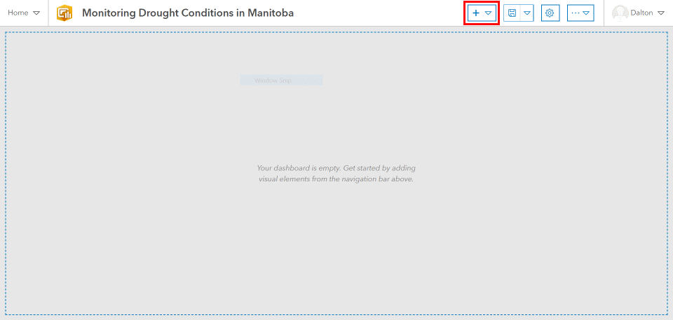
Follow along to create and personalize a dashboard outlining current water conditions throughout Manitoba, Canada. We’ll add a map outlining the data, and personalize the dashboard view by adding other elements to help the end user easily identify the less apparent details surrounding the data. First, navigate to the Operations Dashboard homepage and click “Launch Operations Dashboard”. This will bring you to a view of all your current dashboards, and offer the opportunity to create a new dashboard. Click “Create Dashboard” and give your new dashboard some appropriate details.
Starting with a blank canvas, let’s add the first element to our new dashboard. Click the plus icon and select “Map” to add a map to the dashboard. Choose from any of your ArcGIS maps, or create a brand new one. Next, choose your maps settings by toggling on/off elements like default extent/bookmarks, map legend, layer visibility, basemap switcher, search, and zoom in/out capabilities. Your chosen settings will be reflected in the map view as interactive options for the end user.
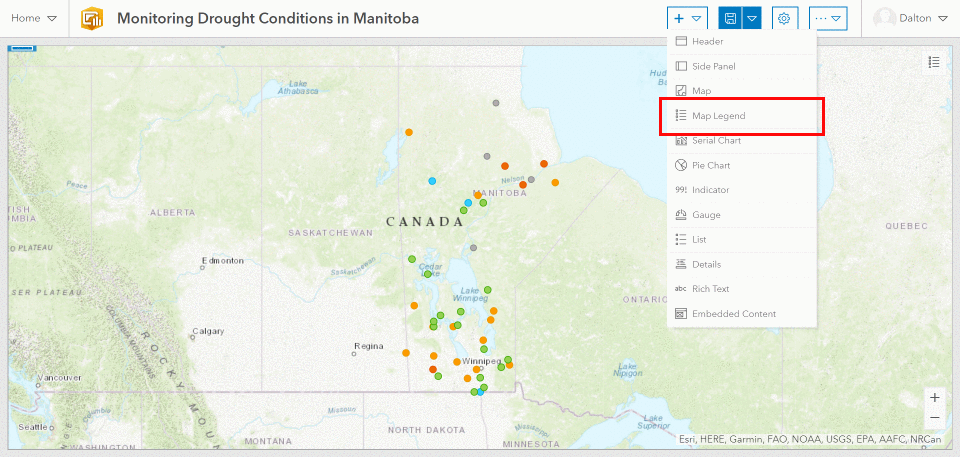
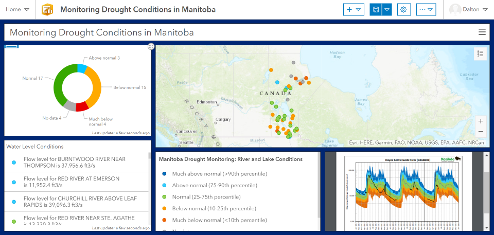
Let’s add a map legend to highlight what the mapped data is showing. Determine which aspect of the data to highlight, in this instance the map legend is explaining what the color of each point signifies. The map legend provides a bit more insight into the data, depicting which points have water levels above, at, or below average levels. Elements within Operations Dashboard are easily modified by dragging and resizing objects to fit exactly how you’d like.
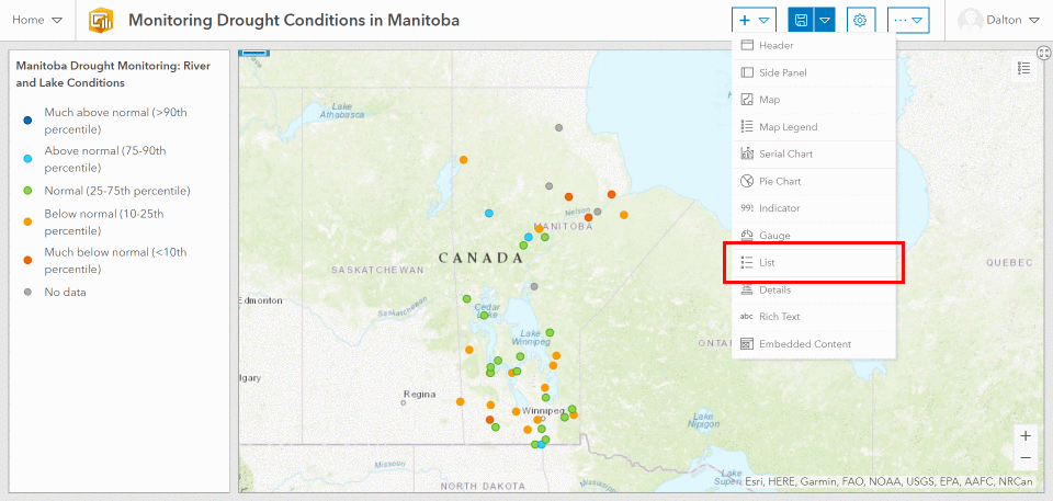
Let’s also add a list to the dashboard. Lists can be customized by leveraging attributes from the data, in this case we’re using the specific water body name and showing the current water level. We now have a smart list showing the name and status of all the water bodies from the data set in descending order. After we’ve created the list, let’s grab the element and dock it in the row with the map legend, for a cleaner look and feel.
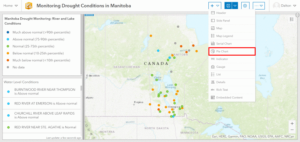
Pie charts are helpful ways to visualize the data. Simply choose which category field to highlight, and start modifying the chart. As a general rule, it’s best to keep pie charts to no more than 6 slices. This pie chart shows the general trends among water bodies in Manitoba, outlining how many are over, at, or under the average water levels. Make your dashboard more visually appealing by matching the pie charts colors to your data set. Then drag and drop the dashboard elements until you’ve found the perfect layout.
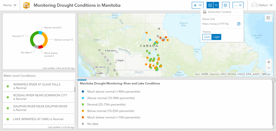
Take advantage of dark mode to tone down the brightness of your dashboard, or to give it a whole new look and feel. It’s as easy as a flip of the switch.
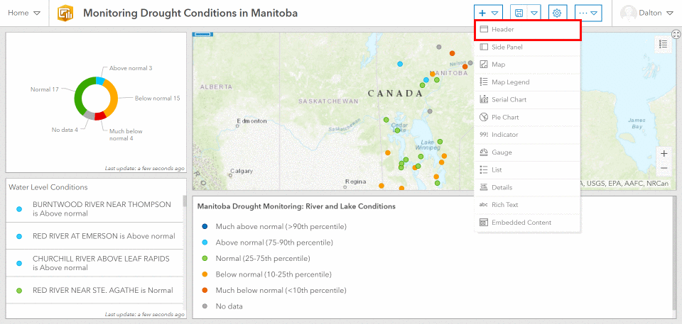
Don’t forget to add the ever important header. Give your dashboard a title and provide end users with a clear notion of what the dashboard is depicting.
Personalize even further by choosing the colors for all aspects of your dashboard. In this example, we’ve changed up the standard white background, and chose a dark blue to highlight the water aspects of this dashboard. Modify further by changing the text, element backgrounds, outline colors, and more.
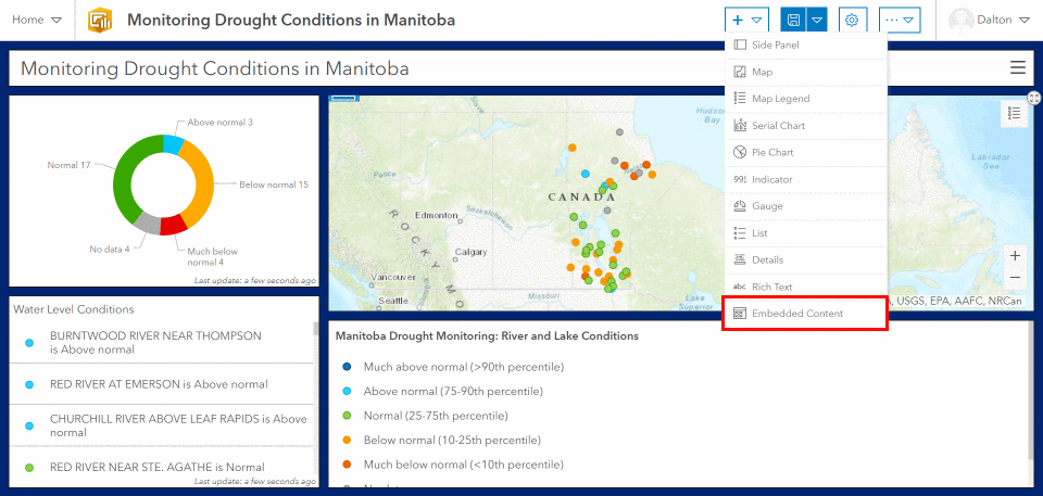
Operations Dashboard also offers the ability to embed content. Here we’ve embedded a PDF file outlining the percentile plot for a given water body. Simply click the plus icon, choose “Embedded Content”, and add your desired document, image, or video by providing the URL path.
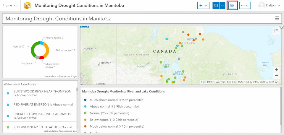
Did you discover that two of your dashboard elements are providing redundant information? Not to worry, as all of the dashboard elements are easily configured by hovering over the element in the top left corner and selecting the gear icon. In the dashboard created so far, the list and legend elements are providing nearly identical information. So let’s configure the list element to provide some additional information that’s not currently available in the map legend. Let’s highlight the specific numbers surrounding the flow level for each water body, which will provide more insight on the physical size and flow rates of these rivers and lakes.
Go Further
Get started by creating your very own dashboard and discover training courses for Operations Dashboard offered by Esri. For example, learn the step-by-step process of creating a real-time dashboard view using this tutorial.
Get a better idea of what you want your dashboard to look like by exploring other great dashboards like these.
– Coral Reefs at Risk of Bleaching Dashboard
– US Coastal Wetlands Investment Projects Dashboard
– City of Salisbury, NC – 311 Request Dashboard
Get Support
Ready to create your own Operations Dashboard? Configure your first dashboard, or reach out to our industry experts to start a conversation about your unique dashboard needs. GeoMarvel focuses on the development of geospatial technology, and we’re happy to discuss your unique needs to create the custom GIS solution you’ve been looking for. Explore our diverse portfolio to discover our past work.