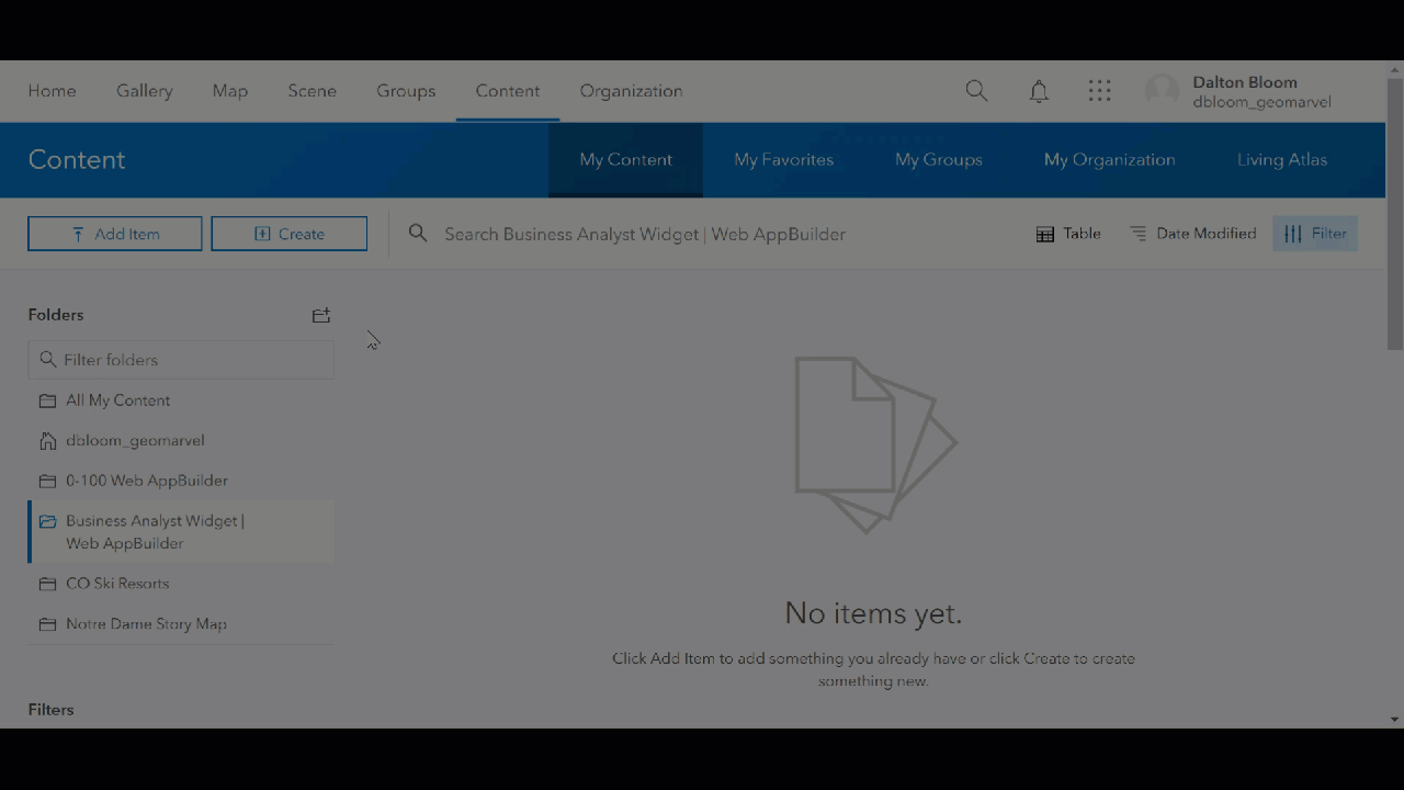
The Web AppBuilder Business Analyst Widget provides you with deeper insight for the location of your choosing. Learn more about a chosen point, line, or address by running reports and generating infographics. Or drop a pin on the map and apply rings, drive times, and walk times, to explore even further. Begin by signing into your ArcGIS Online account, and navigating to the “Content” tab. Here you have the option to create a new web app by choosing “Create”, then “Using the Web AppBuilder”.

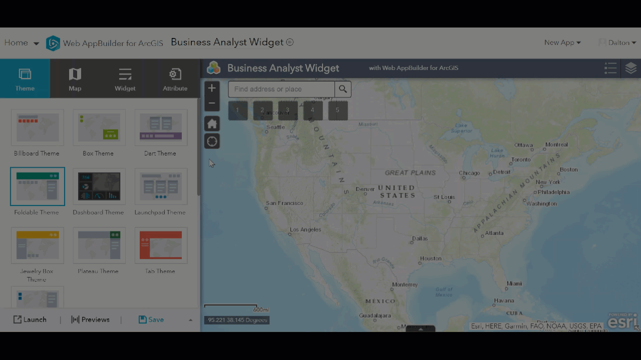
Specify a 2D web app, and give your new web app an appropriate title, tags, and summary. Click “OK” to continue on to the Web AppBuilder for ArcGIS screen.
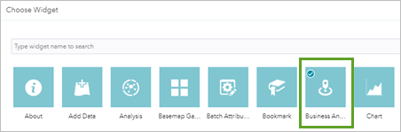
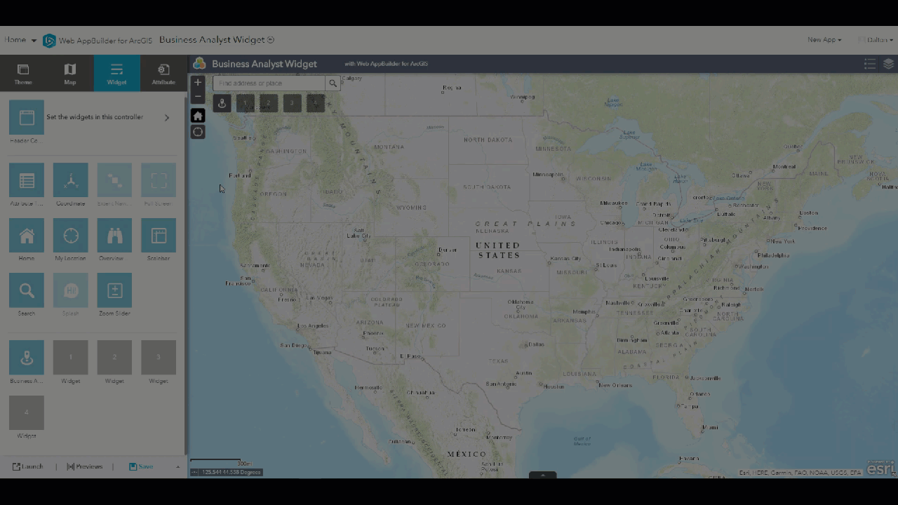
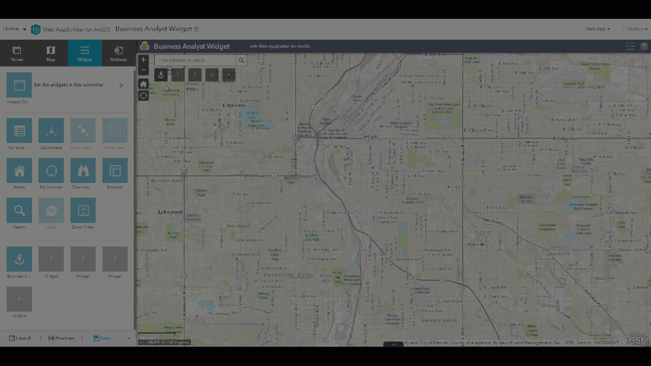
Once in the Web AppBuilder interface, it’s time to add the Business Analyst widget. Select the “Widget” tab, then click on the empty slot “Widget 1”. You’ll be prompted with an array of widget options to fill this slot, choose “Business Analyst”.
Next you’ll have the chance to change the widget settings, including your desired infographics, reports, rings, as well as drive and walk time distances. You can optionally disable any of these features by simply clicking the “Disable” checkbox. With all settings defined, click “OK” to continue on to begin interacting with the map for deeper insight for areas within your country of choice.
Let’s test out and see what the Business Analyst Widget has to offer. Start by searching for an address, in our example we’re looking at an address just outside of downtown Denver, Colorado. Now let’s take a look at some rings of data surrounding this address at 1-mile, 3-mile, and 5-mile intervals. Easily change these ring distances to fully customize your infographic outputs. Click “Apply” to generate the rings, then select your information template. Here we’ve chosen “Demographic Profile”, then select the “Run Infographic” to generate the infographic representation of the data within the various rings to learn about key facts, employment, education and income data. Change the ring distance by clicking the dropdown at the top of the page, to view how the demographic profile infographic changes as you change the ring distance.
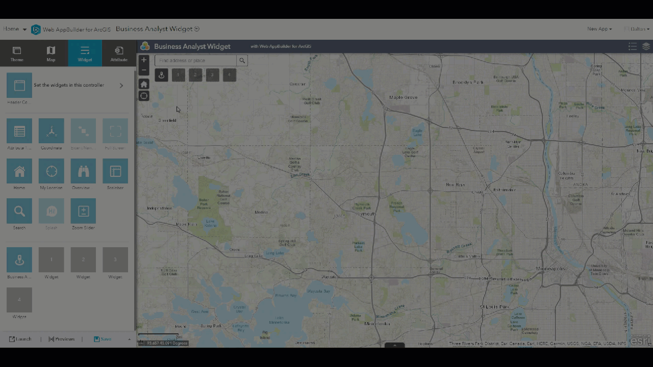
Next let’s create some infographics based on drive time intervals of 5, 10, and 15 minutes. Again, we’ll begin by searching for an address. This time we’ve chosen to investigate an area of Minneapolis, Minnesota. Select the “Drive Time” tab, and adjust or leave the default drive time intervals, then click “Apply” to generate and visualize each drive time on the map surrounding your chosen address. With the mapped drive times created, let’s choose a new infographic template to generate based on those drive time intervals. In this example, we’ve selected “Marketing Profile”, which presents key facts like average household size, median household income, tapestry segments, and much more. By choosing different drive times from the dropdown at the top of each infographic, we can adjust the total area to be addressed by the infographic.
Next we’ll investigate various walk time intervals in the state of New York. First we’ll choose a specific address, then select the “Walk Time” tab. This time we’ve chosen the “Transportation to Work” template for our infographic of choice. By clicking “Run Infographic”, we can generate information based on the varying walk times. This infographic presents worker and transportation information, to give a better understanding of how people in this area get to work everyday.
This was a brief overview of the potential that the Business Analyst Widget and associated infographics have to offer. There’s a ton of information stored here, putting the power in your hands. Additional Esri infographic templates include At Risk Population, Employment Overview, Health Care, Population Trends, Tapestry Profiles, and much more. It’s important to note that using the Business Analyst Widget will consume credits. Before diving into the potential of this powerful tool, consult your organization’s admin to ensure you have credits available.
Get Support
Start leveraging the power of infographics and the Business Analyst widget within Web AppBuilder for ArcGIS. Looking to take infographics even further? Explore your options by contacting our GIS and development experts to start a conversation about your unique needs today.