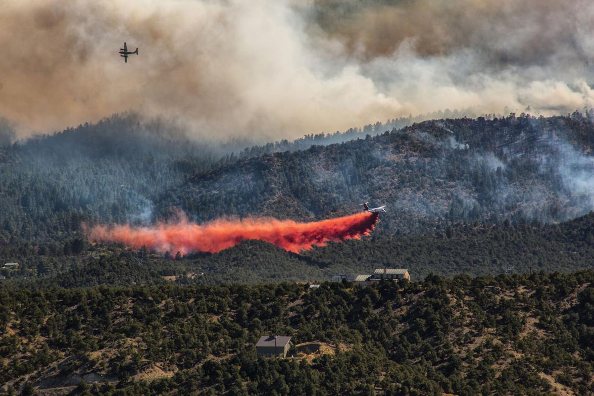
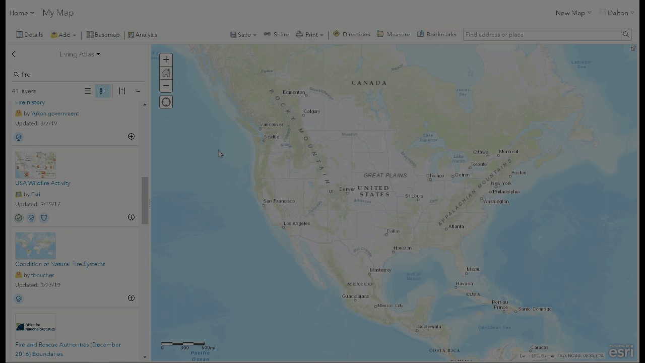
The ongoing Decker wildfire near Salida, Colorado has been raging on for over a month. The Living Atlas of the World offers a data layer called “USA Wildfire Activity“, where users can view and analyze real-time wildfire data from all over the United States. Let’s explore the Decker wildfire data to learn more about how it has moved over time.
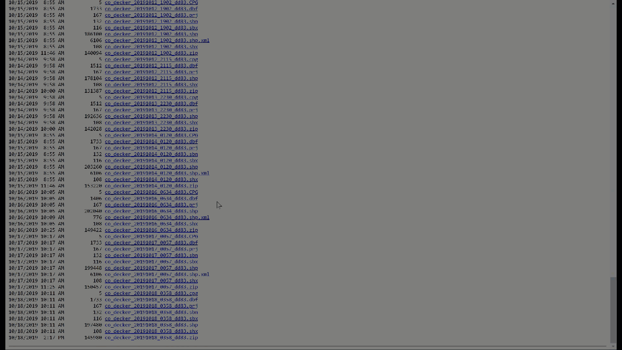
First things first, let’s look into the “USA Wildfires” data layer from the Living Atlas. Inspecting the layer’s source data directory, we can gain access to all uploaded data for this layer. Here we’ll navigate through the directory to access the files specific to the Decker wildfire.
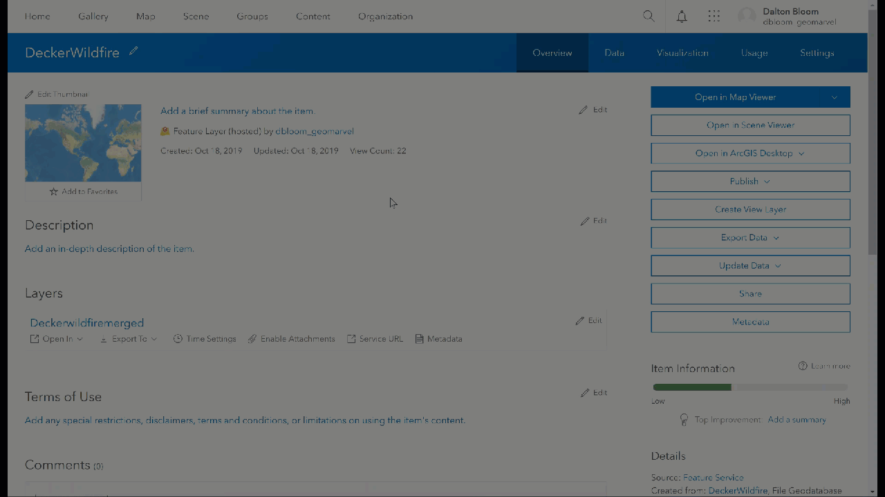
By downloading each ZIP file and extracting the data, we can load everything into ArcGIS Online.
With our data downloaded and feature layer created in ArcGIS Online, it’s time to make this layer time-enabled. Navigate to the feature layer, then click the “Time Settings” button, followed by the “Enable time” checkbox. With time enabled, we can now specify which field represents the time and date. With time enabled, when we open the map view the time slider is now visible at the bottom of the screen.
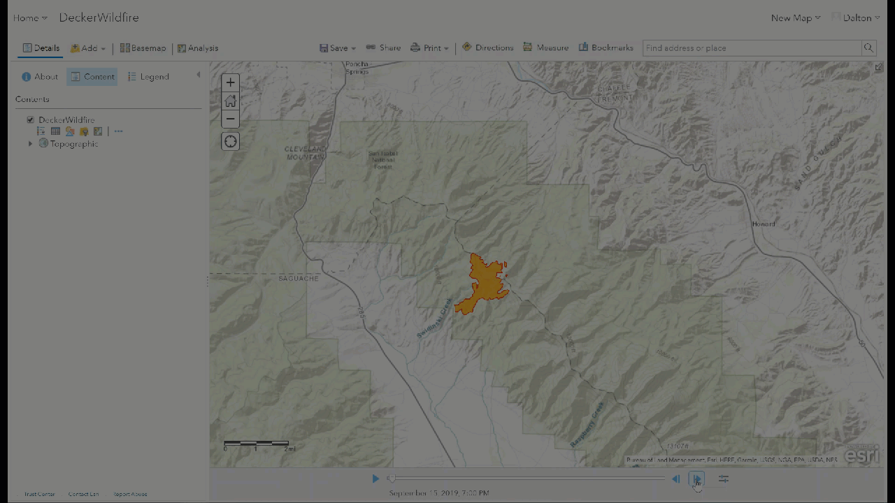
Let’s give the Decker wildfire more appropriate symbology by changing the symbol and border colors. Next, on the time slider at the bottom of the screen, click the rightmost button to edit the layer’s time settings. The “Advanced Settings” option let’s you determine the length of each time interval. Here we’ve changed the default 3-day time interval to a 1-day interval. And we’ve chosen to stack the data on top of each other as time moves forward, to see how the fire grew in size and shape over time.
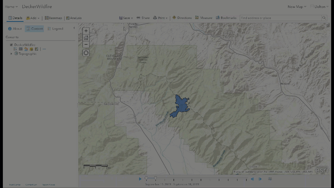
With our time settings configured, we can now view the daily progression of the Decker wildfire. By using the left and right arrows on the time slider, it’s easy to move through the days to see exactly how the fire changed and grew over time. Find more information on enabling time on data layers here.
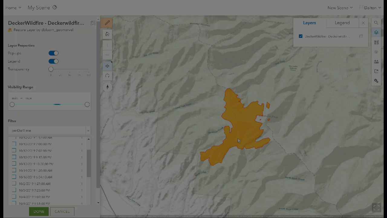
Although we can’t view the time slider within a scene, we can still visualize the data in a 3D environment. Viewing the Decker wildfire within a 3D scene can be helpful in determining exactly how the wildfire spread over time. Perhaps additional data can be added (such as wind speed and direction) to further explore how and why the fire spread as it did.
Yesterday’s update on the Decker wildfire informs us that the fire has currently spread across 8723 acres, and it’s only about 30% contained. With 21 crews, 8 helicopters, and 30 engines on the job, there are over 680 people assisting to extinguish the wildfire, which has just been declared the top US wildfire priority.
The ArcGIS platform provides some great insight into the origin and spread of these wildfires. This valuable insight can help crews work more efficiently to target the wildfire hot spots and the vulnerable surrounding areas to evacuate nearby households, and to prevent further spread and destruction. For more information, check out this detailed story map of the Decker wildfire.
Get Support
Are you looking for professional GIS support for your next project? We can help! GeoMarvel’s GIS development experts can help you leverage the ArcGIS platform for your unique GIS needs. Explore our vast portfolio of past successes, and reach out to our industry experts to start a conversation today.